Challenges & Objectives
/ Project Overview
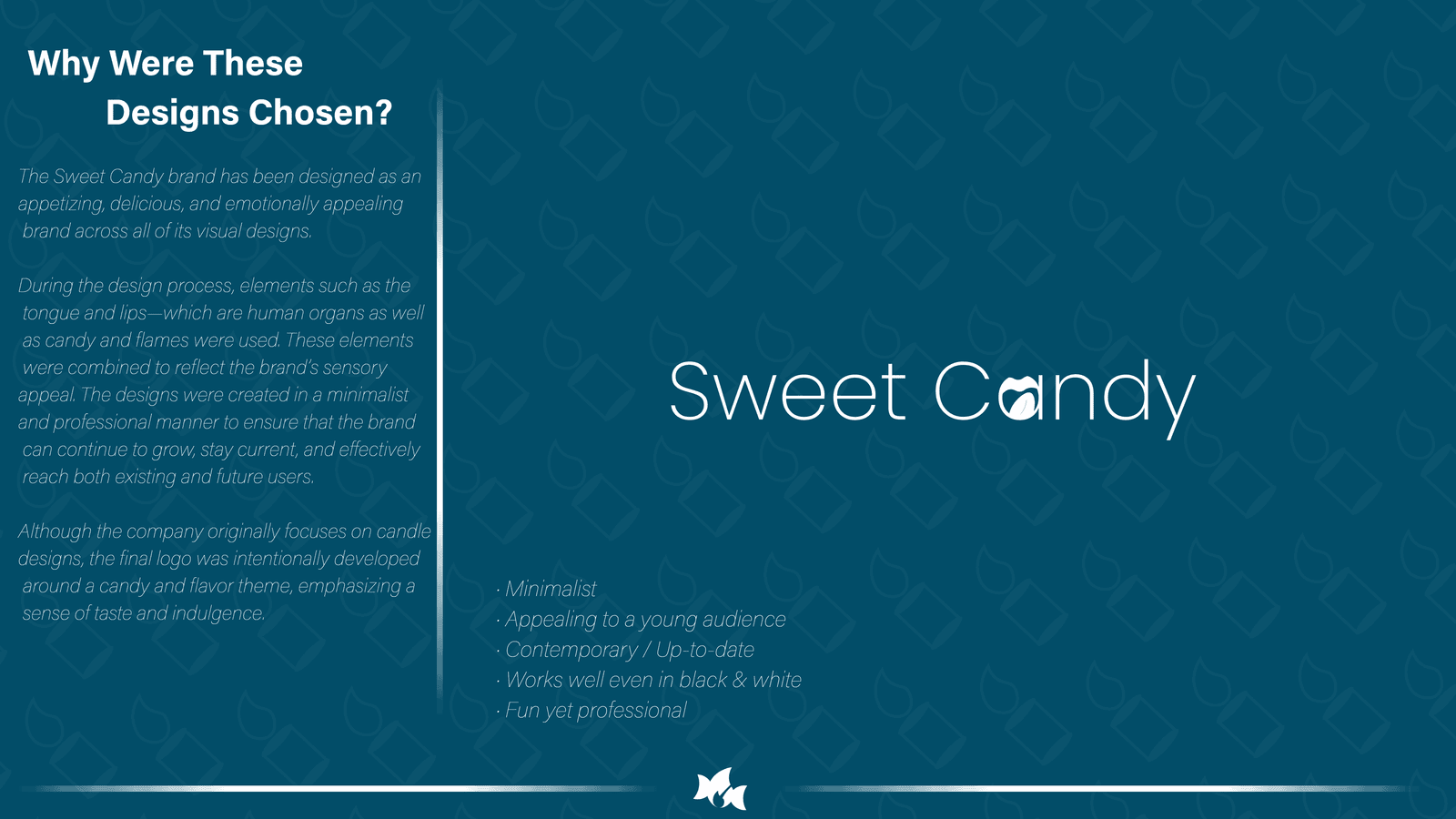
Sweet Candy is a conceptual brand identity created for a premium scented candle and fragrance company. The project focused on developing a memorable visual identity that combines sweetness, warmth, and elegance while remaining simple and highly recognizable across digital and print applications.
/ Challenges
Creating a logo that instantly communicates the feeling of fragrance and sweetness without relying on literal candle illustrations. The identity needed to feel modern, minimal, and adaptable for packaging, social media, and e-commerce platforms.
/ Design Strategy
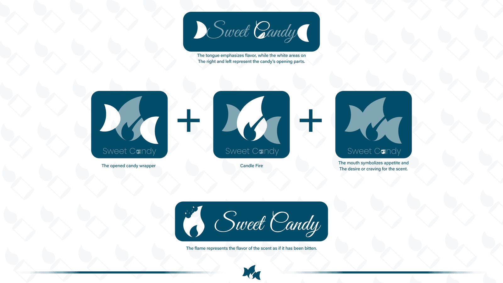
The visual identity was built by combining three symbolic elements into a single mark:
• Candy wrapper
• Candle flame
• Lips & tongue (representing taste and sensory experience)
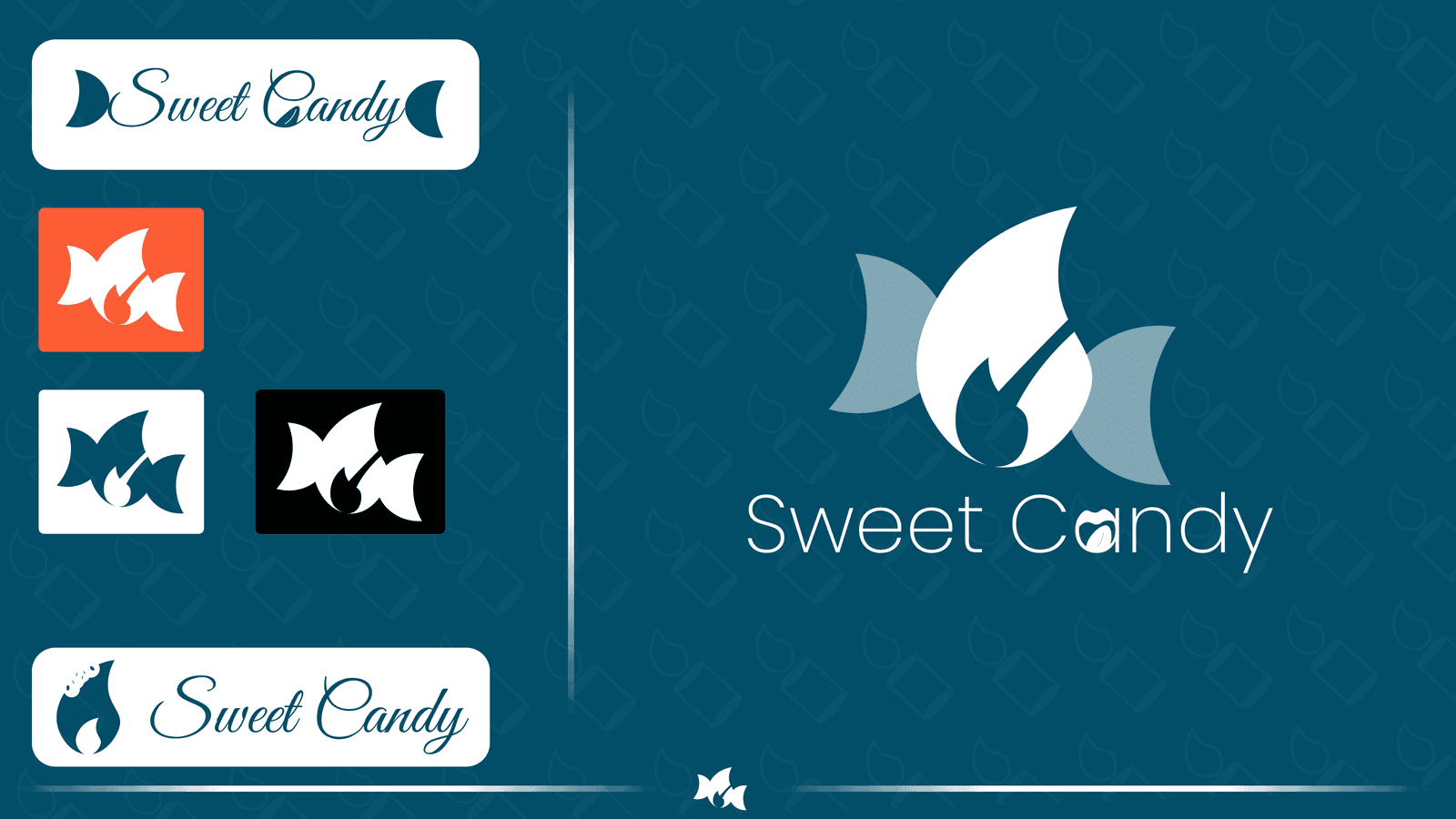
These forms were simplified into one cohesive symbol to create an icon that is distinctive, scalable, and easy to remember.
/ Color Palette
A deep teal was selected as the primary brand color to communicate trust, quality, and sophistication, while white provides balance and clarity. Accent colors were intentionally kept minimal to allow the logo to remain the visual focus.
/ Typography
A lightweight typeface was chosen to contrast the bold symbol, creating an elegant and approachable personality. The typography reinforces the premium yet playful character of the brand.
/ Applications
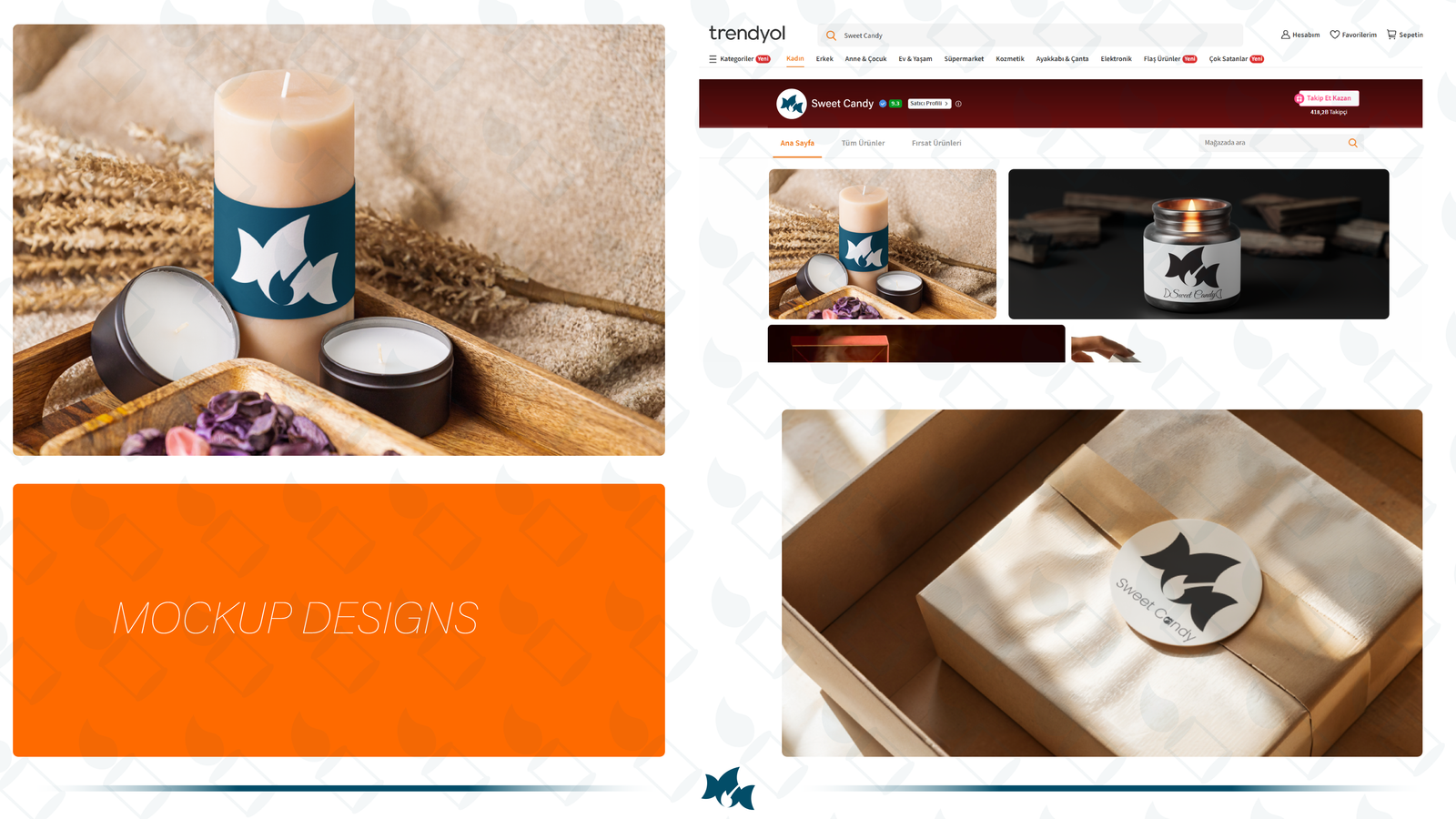
The identity was designed to perform consistently across multiple touchpoints, including:
- Product Packaging
- Candle Labels
- Gift Boxes
- E-commerce Store
- Social Media Assets
- Marketplace Listings
- Promotional Materials
/ Outcome
The final identity delivers a clean, memorable, and versatile branding system that can grow with the business. Its minimalist construction ensures strong recognition while maintaining flexibility across both digital and physical products.